Nike Swoosh Explained: Meaning, History & Branding Lessons
The Nike Logo: Meaning, History, and What the Swoosh Teaches About Branding
The Nike “Swoosh” is one of the most recognizable marks in modern design, yet it began as a simple, low-cost graphic meant to communicate speed and movement. Understanding how the logo evolved—from its early wordmark days to a standalone symbol—reveals practical lessons about simplicity, consistency, and building meaning over time.
What the Swoosh Represents
The Swoosh works because it communicates a lot with very little. Its power isn’t hidden in tiny details—it’s in the overall shape and what that shape suggests at a glance.
- Motion and velocity: the curved stroke implies acceleration, like something cutting through air.
- Energy and confidence: it reads as a swift, decisive gesture—minimal, but assertive.
- Victory association: “Nike” references the Greek goddess of victory, nudging audiences to interpret the mark through achievement and winning.
- A container for meaning: the Swoosh became iconic as Nike repeatedly attached it to athletes, moments, and performance narratives.
In other words, the Swoosh didn’t arrive “famous.” It became famous by consistently showing up where performance mattered.
Origin Story: From Blue Ribbon Sports to Nike
Nike’s story starts before the name “Nike” existed. The company began as Blue Ribbon Sports (BRS), which distributed athletic footwear before shifting into a distinct brand identity of its own.
- BRS to Nike: moving to “Nike” aligned the brand with a clearer, more mythic concept: victory and athletic achievement.
- Symbol plus typography: early identity systems often need both word and icon so customers learn what they’re seeing.
- Brand promise alignment: the name and the symbol work best when they reinforce the same idea—performance, momentum, and winning.
For a brand builder, this is the quiet lesson: the strongest visuals don’t “decorate” a business; they reinforce a promise the business can keep.
Who Designed the Nike Logo and Why It Worked
The Swoosh was created in the early 1970s by graphic design student Carolyn Davidson. Its durability comes from smart constraints rather than ornate creativity.
- Designed for movement: on footwear, logos are rarely viewed straight-on. The Swoosh holds up from angles and in action.
- Simple reproduction: it needed to be easy to print, stitch, and scale across materials without losing its identity.
- Shape-first thinking: the silhouette is unmistakable even when it’s tiny, cropped, or seen from a distance.
This is why intricate logos often struggle in the real world: if the mark can’t survive low-resolution printing, embroidery, or quick glances, it can’t build recognition reliably.
Nike Logo Evolution: Key Milestones
Like many iconic identity systems, Nike’s logo didn’t skip straight to “symbol-only.” It earned that privilege through years of consistent repetition, gradual refinement, and smart pairing with the brand name.
| Era | Primary Look | What Changed | Brand Lesson |
|---|---|---|---|
| Early 1970s | Swoosh introduced with Nike text | Symbol and name used together | Teach the audience what the symbol stands for |
| Mid-to-late 1970s | Refined lockups | Improved proportion and clarity | Iterate without losing recognizability |
| 1980s–1990s | Swoosh gains prominence | More consistent usage across products and campaigns | Repetition builds memory |
| 1990s–present | Swoosh-only in many contexts | Symbol stands alone at small and large scales | Earned simplicity becomes a strategic advantage |
A helpful framework for any business: symbols often start as “supported” (with the brand name) and become “independent” only after recognition is built through repeated exposure.
Typography and the Role of “Nike” as a Wordmark
When a brand is still becoming known, typography does heavy lifting. It clarifies pronunciation, boosts recall, and makes the identity feel anchored rather than abstract.
- Early-stage clarity: a wordmark helps customers connect a new icon to a name they can say out loud.
- Mature-stage flexibility: once recognition is high, the wordmark can shift to places where clarity is required (packaging, signage, legal use) while the symbol leads in storytelling.
- Consistency beats novelty: stable type treatment makes the overall system feel deliberate, not trendy.
- Unified “energy”: typography and icon should share a similar rhythm—angles, weight, and attitude—so they read as one family.
Branding Lessons Designers Can Borrow from Nike
The Nike logo is a case study in how meaning accumulates. The mark stays simple; the brand’s actions do the explaining.
Design Inspiration: How to Apply the “Swoosh Principles” (Without Copying)
A Deeper, Downloadable Walkthrough of the Nike Logo’s Meaning and Evolution
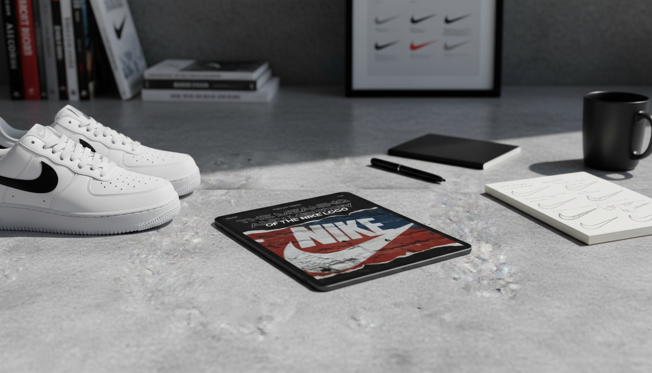
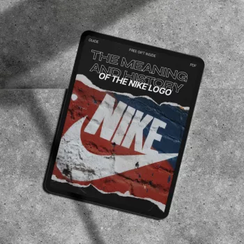
If you want a structured reference that connects the logo’s timeline to practical takeaways, explore this digital resource: The Meaning and History of the Nike Logo – Complete Guide (Digital Download). It’s designed for designers, students, and brand builders who want a concise guide to symbolism, evolution, and design decisions that translate to other identity projects.
For a separate example of how simplicity and systems thinking can reduce friction in real life, this planning-focused download is also available: One Bag, Two Weeks, Zero Stress – How to Pack a Carry On for Two Weeks.
Sources for Further Reading
- Nike, Inc. — Official Website
- Nike Heritage and Company Timeline — Nike News
- Portland State University (background coverage on Carolyn Davidson)
FAQ
What does the Nike Swoosh mean?
The Swoosh is widely interpreted as a symbol of motion, speed, and forward momentum. Its meaning is reinforced by Nike’s association with victory and athletic performance over decades of consistent use.
Who designed the Nike logo?
The Nike Swoosh was created by graphic design student Carolyn Davidson in the early 1970s. Its long-term success comes from its simple, scalable shape that works across products and production methods.
Why does Nike sometimes use only the Swoosh without the word “Nike”?
Because the brand has built such strong recognition, the Swoosh alone is enough to identify Nike in many contexts. Years of consistent exposure made the symbol a standalone shorthand for the brand.


Leave a comment